What’s kept in is of more importance than what’s new – a design theory for restoration that crosses over to logos and brand identities.
An example of this theory came in the form of a very enjoyable project to update an existing logo.
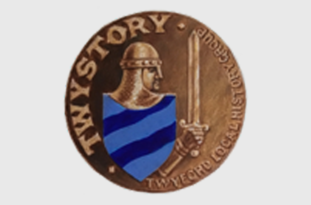
Local history group, Twystory, had found themselves in the unfortunate position of having misplaced their brand assets. The only file that remained was a blurry, low resolution file (shown below) that was not fit for purpose or for, well… anything.

The initial brief was to redraw the logo and restore it to its former glory. While this was possible, it felt like the perfect opportunity to give the logo a bit of an update and evolve it so its could be used on a wider variety of applications.
I wanted to retain as much of the original logo as possible, so that it would still be recognisable for its unique appearance and remain meaningful to the group. Simplifying the character gives it a more modern feel without losing the strength of the original.

In addition to the roundel, a landscape option was also produced.

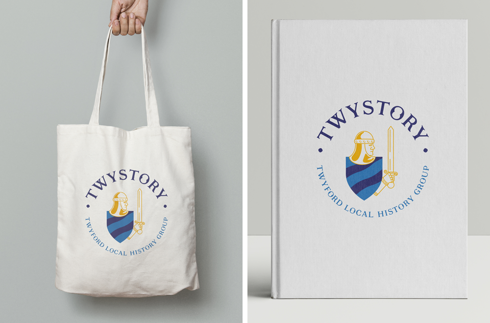
The logo lends itself well to multiple forms of merchandise, relevant to the group’s activities.

