JMC.DEV
Responsive logo and identity design for a conscientious web developer.
James Clarke is a talented web developer specialising in front-end and working as JMC.DEV. Over the last decade he has honed his skills and iterated his process to be able to deliver outstanding projects for a variety of end clients, including well-known household brands.
The project
During our briefing session we discussed how James approaches website builds and why his belief in ‘clean’ code shapes the way he works. He sees website development as a true craft, and as a result cares as much about how his code appears to other developers as much as the functionality and visual appeal of the end product.
A developer of principle, James champions accessibility in his projects, ensuring that standards are met and websites are inclusive. He achieves this through a methodical build process and a close relationship with designers and clients, giving advice where required on best practice.
James is an advocate of the Block Element Modifier methodology, a way of building websites that enables reusable components while ensuring all developers working on a project are speaking the same language. The BEM method streamlines design and development time and ultimately has multiple benefits to the client.
Influence from accessibility and responsive website development
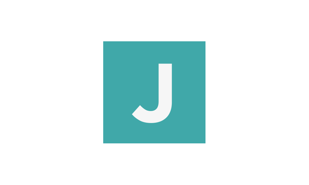
Taking the key elements from the brief helped to shape the direction of the logo for JMC.DEV. It had to be clear and clean, using a typeface with high legibility to make it accessible. The colours are inspired by those used in code editors, and are slightly muted in their tones as a reflection of the understated nature of the mostly unseen attention to detail in James’ work. The colours also adhere to guidelines on colour use and legibility online.
The BEM methodology has the most influence in the responsive nature of the logo. While not a key part of the original brief, it was soon apparent that due to the multiple applications in the digital world that the logo would need to inhabit, that it would benefit from being able to change shape and shift to accommodate any space. The logo reflects the way that websites are constructed using BEM – created from block elements that are able to shuffle while retaining the same content structure and look and feel.
The ‘dot’ remained prominent throughout the original concepts and into the final design. It is an important signifier to the type of company JMC.DEV is as well as transforming the logo into the URL of James’ website. To further the identity, a pattern was created that could be used in a number of applications.

Reception
“I couldn’t be happier with my logo. Andy’s thoughtful approach and the responsive and adaptable nature of the logo give me so many options for both digital and print use – and it looks great in all shapes and sizes.”
James Clarke
