Newhall Court
Identity and marketing campaign design to promote availability of a unique office suite in Birmingham's Jewellery Quarter.
The opportunity to lease a unique office space in Newhall Court, situated in Birmingham’s Jewellery Quarter, needed to be marketed to potential occupiers. Working with Carousel Marketing I produced an identity design for the campaign covering a direct mail brochure, email shot and website.
History
Newhall Court – formerly known as Newhall Works, was once the site of a wire and pin factory. Amongst other items manufactured by the factory during the early part of the 20th century, were paper clips and this historical detail was taken as a starting point for the look and feel of the logo and identity. Not only does the logo icon take inspiration from this heritage, but the use of wire-like lines also represents the current urban connectivity of the location.

The property was a series of interconnected office spaces, each with their individual characteristics and quirky features. Commissioned photography was used to captured this variety. The offices had been refurbished to modern specifications and this was reflected in the clean, contemporary design style for the logo and campaign collateral.

Direct mail design
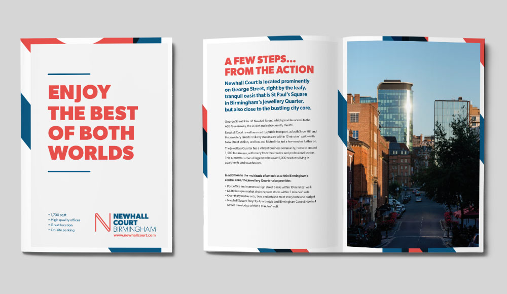
A direct mail solution needed to provide enough information about the property and the wealth of photography whilst keeping within a designated size and weight.
The solution came in a folded printed piece, small enough to fit into a standard C5 envelope, that expanded to give impact and communicate the type of office space available. To keep the weight within the required range an uncoated paper stock was used that was lighter but retained the thickness and quality feel. The act of unfolding a mailer to a larger sheet ensures readers are naturally more engaged with the brochure and creates interest, thus resulting in a far more memorable experience.

Online marketing
A combination of marketing methods gave greater coverage and an increased opportunity for the campaign to be seen. The look and feel of the direct mail pieces continued online, with photography taking centre stage and clean styling giving clarity to the message.

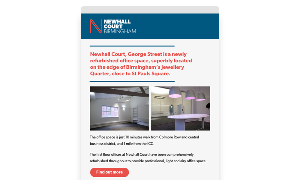
Following-up the direct mail piece, an email campaign built on the familiarity that had been established to bring about higher engagement from recipients.
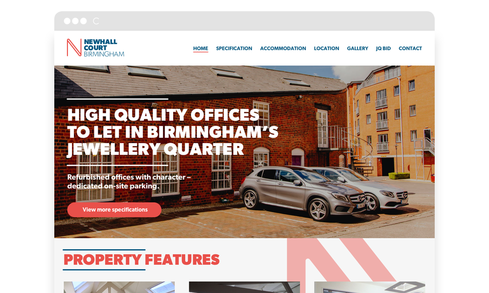
A bespoke website showcased the property and served as a further route for generating enquiries. Once the initial marketing process has been completed, websites such as this can be repurposed as a hub to communicate with tenants and provide a central resource for procedure documents and facilities contacts.
Reception
The campaign was a success, creating a lot of initial impact and request for viewings from the initial direct mail. The campaign had originally been planned to include two runs, but with a lease agreed ahead of time, the second was not required.
The campaign is a strong example of how innovative thinking in direct mail pieces, alongside good design, works to carry a clear message that people will react positively to. Consistency across a campaign, online and offline, gives an impression of quality and professionalism to potential clients that will last for the duration of the relationship you build with them.


